Web Design Trends 2022
Web design trends always surprise us by bringing many innovative features. These features focus on making everything more user friendly.
It generates more curiosity. So we often seek the answer to these questions- What are the newest trends in website design? How will web design look like in the upcoming year?
Through this article, I will try to cover a few modern web design trends for 2021. In order to be familiar with these new web techniques, you must keep reading.
The newest web design inspirations:
- Animations
- Motion & Interaction
- 3D Elements / 3D colors
- Color trends
- Typography
- Dark mode
- Illustration
- Minimalism
- Neumorphism
Web Designs Make Truly Unique User Experience
Designers continuously try to practice and utilize distinctive items to serve the users according to their needs. And they never fail to amaze their users. Meet the most peculiar design inspirations:
Animations
Animations is a most used design trends in web design. Now, it is becoming more popular than before. Web designers are steadily implementing, practicing animation trends to get the fast response of users.
Animations make your web page eye-catching, helps to grab the attention of users, and provide messages instantly. In consequence, they can understand the content without reading them.
Animated Backgrounds, hover effects, progress bar, sliders, text are a digital way to build a strong relationship with users.
Simple animated features keep users engaged for a long time. But overdoing can leave visitors in confusion.
Motion & Interaction
Plenty of ways are available to charm your visitors. But utilizing motion interactivity, you may make your initial impression bigger. Motion can turn your pale face designs into a gorgeous one, causes the user’s engagement period to be lengthy.
3D Elements
Another design trend is using 3D objects. We all know what 3D is? It’s not a new item. But right now- in 2021, it’s gaining extra popularity. Three-dimensional elements allow designs to seem realistic and alive. So it can be a handy schema to steal your user’s concentration.
Next Great Thing for 2022
People like to explore new things which can also give them coziness to work with. So to grab the users eye you must build friendship with these exclusive design elements:
Neumorphism
Neumorphism is a scheme that lets you experience both skeuomorphism and flat design. Where things like using low contrast, solid and pale colors, shadowing-drop shadow, inner shadow exist.
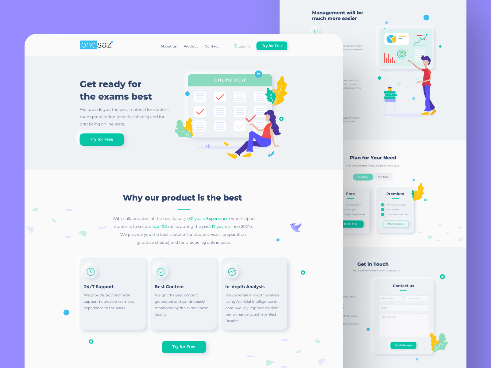
Somewhere this visual design lets us feel that things are coming out from inside of the background. Here subtly applying colors and shadows trick things to looks like popping up.
Again, neumorphism resembles the 3D design. This design trend is a fun thing for human beings with good eyesight. But it is a non-affordable design trend for people who have vision problems.
Minimalism
Minimalism is all about simplicity. This concept is about designing with fewer elements, comfortable typography, using black and white design elements, putting hand-drawn stuff, keeping the perfect amount of white space between the contents.
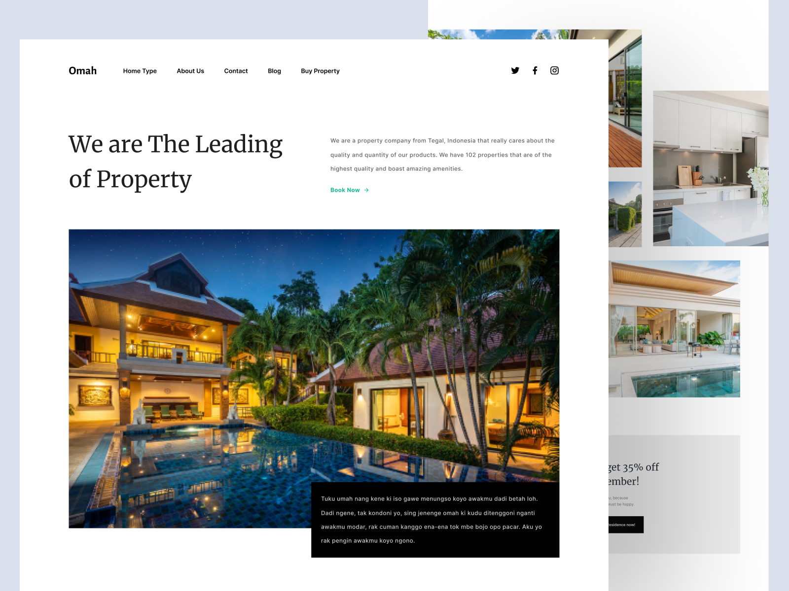
These white spaces compel users to pay more attention to your content, ensure they get the correct information about your websites well, helps your page to load faster.
Illustrations
The goal of design trends is to give a better user experience, make things accessible for them. As a result, they can fully interact with them.
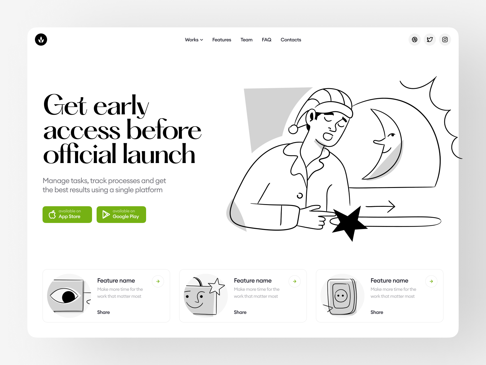
Illustrations express more about your brand’s products or services, helps to build greater interactivity between you and your users.
So they can guess the contents of your page in a blink. Illustrations are also a great way to boost the user’s engagement time.
Web Design Trend: Reduce Eye Strain
Web designers always try to keep in mind user’s comfort while working on website designs. So they tend to build creative items that also cheer the users. You can experience them by the great example that is given below:
Dark Mode
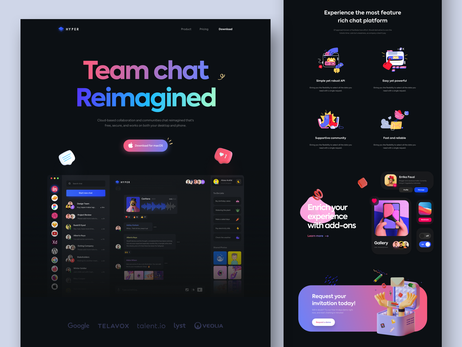
Dark mode is one of the top design inspirations. Most of the designers allowing users to switch their device appearances into a dark mode. It creates less pressure on the user’s eye, keeps their eyes safe. It saves the device battery life.
Color Trends
Today, in the digital era, many of us use our time sitting in front of the computer. This creates pressure on our eyes, so web designers produce the trend of utilizing pastel or pale colors. Soft color palettes keep user’s eyes strain-free and increase readability.
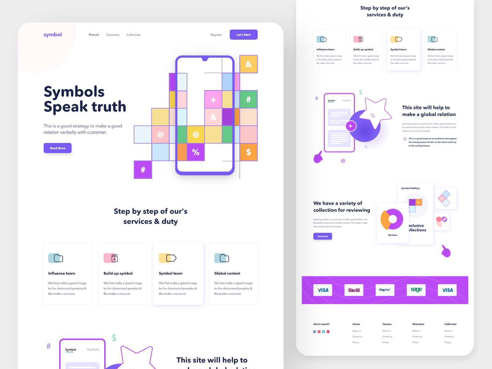
Colors affect people’s emotions. As a designer, if you use color schemes cleverly, you can create an emotional connection with users. As long as they’re attached to you, they will stay for a long time.
Typography
Nowadays, Bold and big fonts are trendy in web design. Although it’s not a new thing in web design, designers are applying it more often, day by day it’s getting more famous. If you ask why?
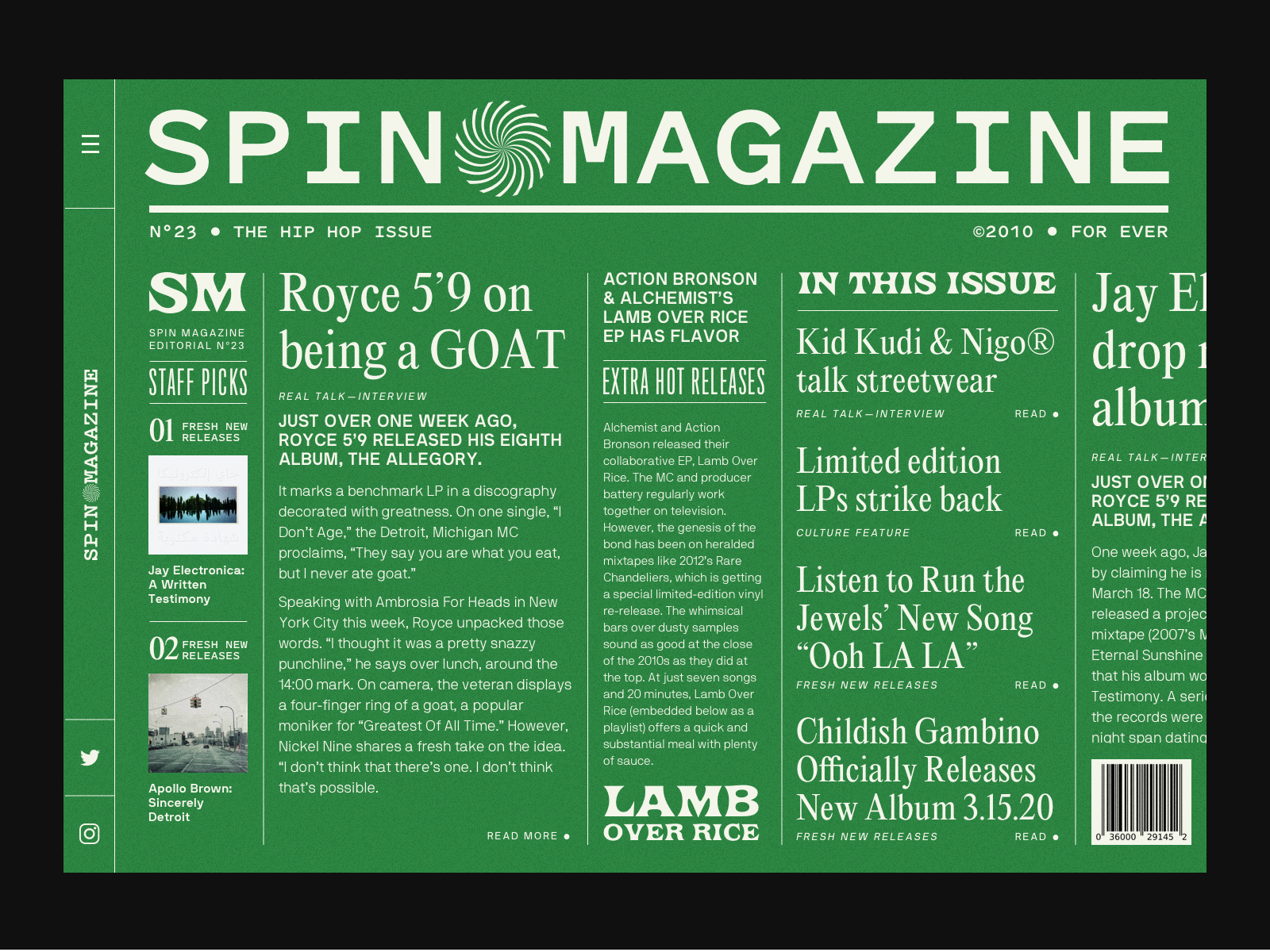
Well, the answer is obvious- every designer desires to catch the user’s sights as fast as possible. And Big headlines, bold typography, can force things to be noticeable to the user fast.
Many visitors observe headings only. For those kinds of people, applying catchy typography in the headlines is necessary. Bold fonts are healthy for people who have vision impairments, bold fonts can highlight your major segments to them.

